HOLY HOP
Holy Hop is a new beer on the market in Belgium. The customer wanted to distinguish himself from the rest by a modern design that will attract both the youth and adults.
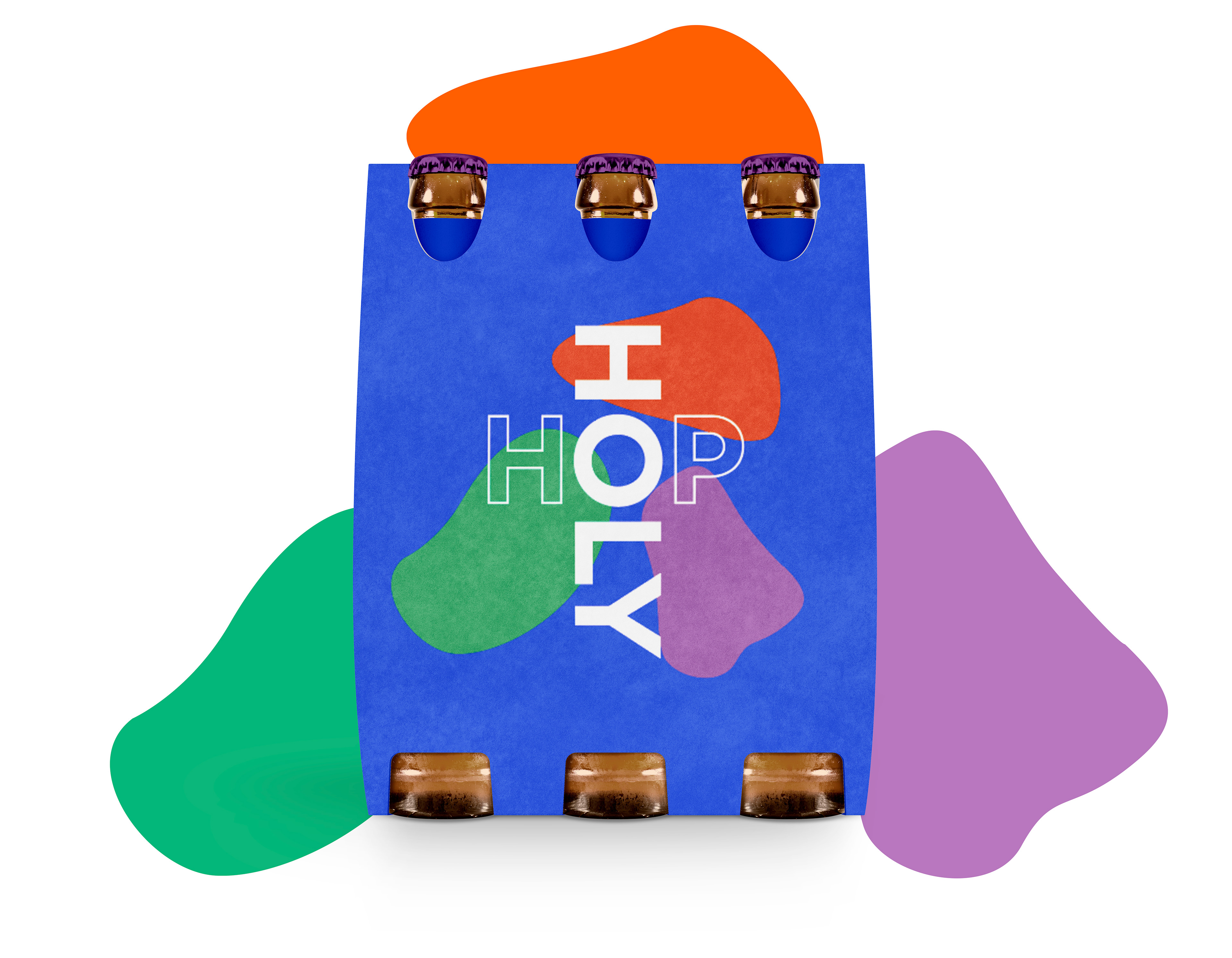
The 3 shapes represent the holy trinity and can be replaced by the three main ingredients of beer: water, hops and yeast
I also had the chance to choose the name of the brand in collaboration with the client.
The logo is made out of typographic elements and is shaped as a cross (refers to holy)
Because of ‘some virus’ that is currently taking over the world, this project was put on hold for a while. I’ll keep you updated!

Multiple types of beer
The client wanted to conquer the market with mutiple types of beer.
A unique color was chosen for each type of beer.
I strongly believe that these colors are going to attract the public
and that Holy Hop is going to stand out among the other beers in shops.
