MEMLING
Memling is a unique concept in Ronse that consist
a mini-museum and pub all in one.
My client wanted a retro vibe with a modern touch.
I choose a typographic logo with a selfmade M.
The ‘M’ is unique and can be recognized very easy.
All brand-elements are particles of the letter ‘M’
I decided to work with 2 main colors: dark brown and rose.
Those two colors represent the two main groups they
want to attract: young people and (older) tourists who visit Ronse.

Multiple assets
For this case I made all possible assets that would fit for Memling.
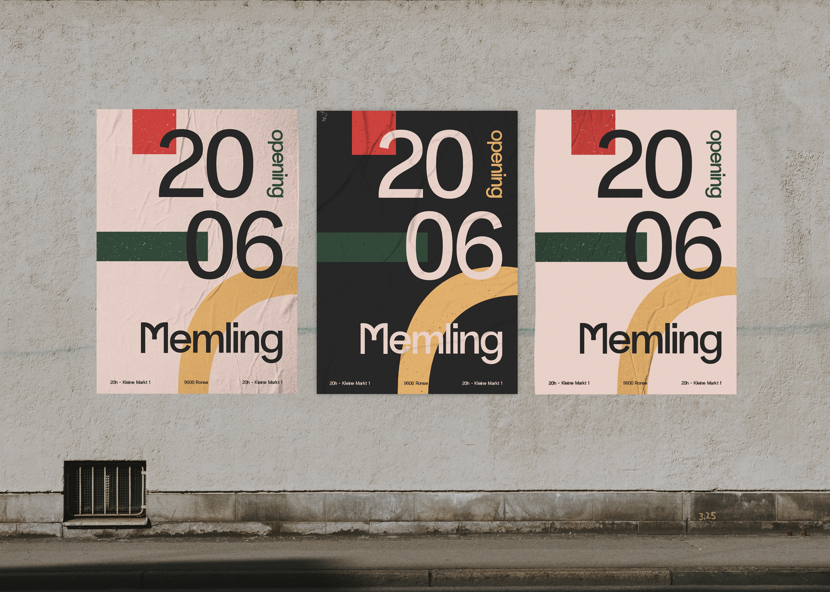
I choose to use posters to announce the opening.
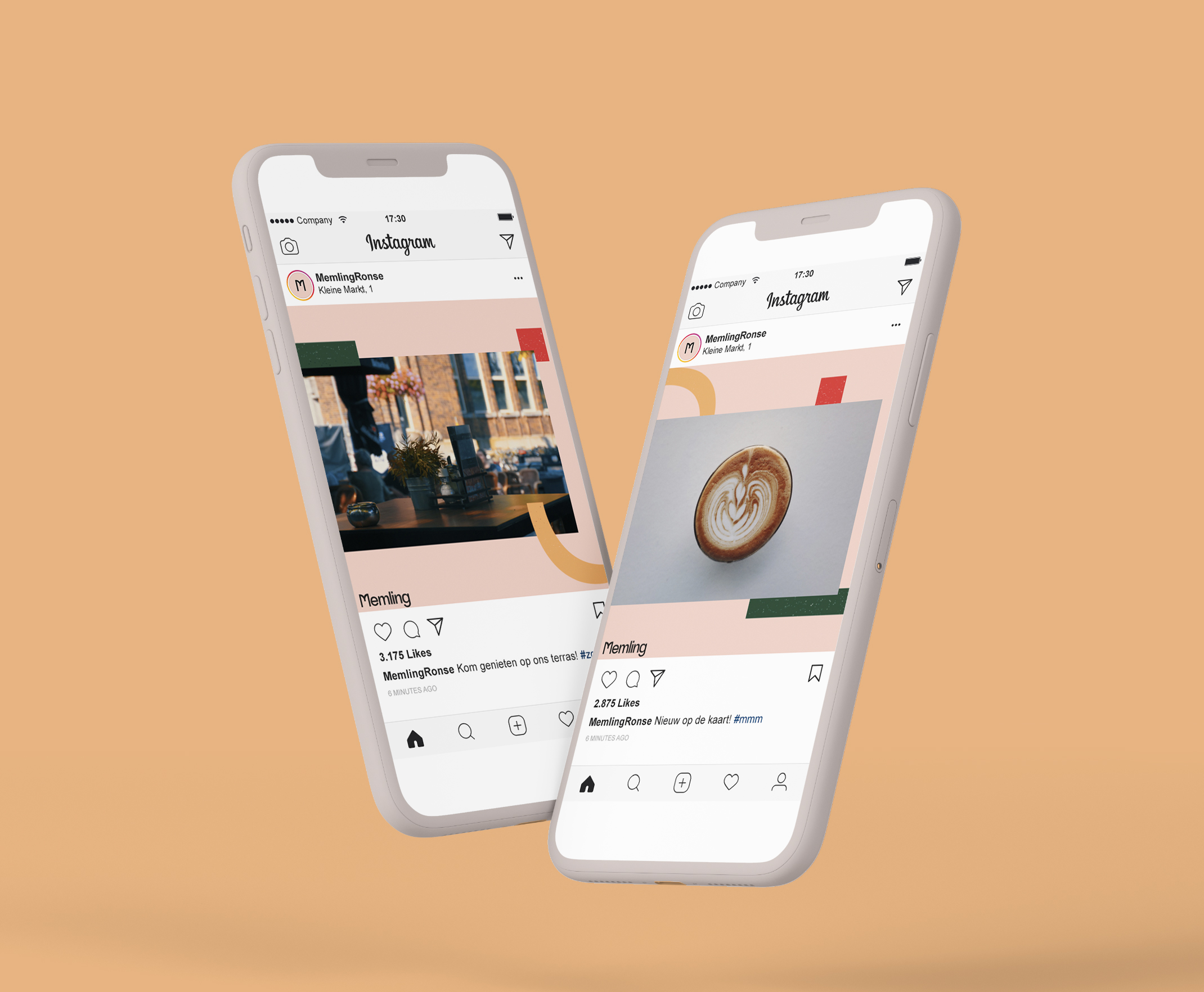
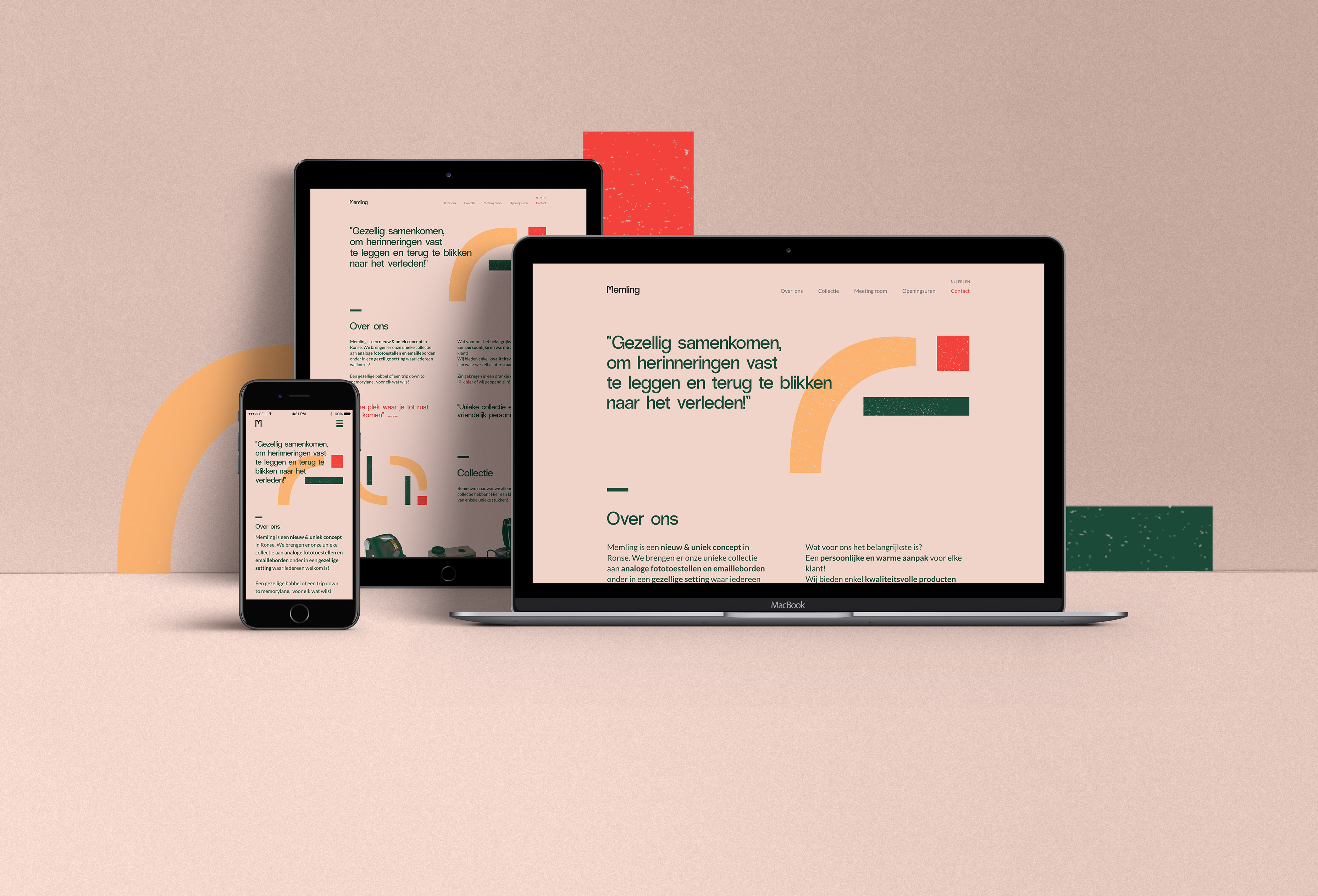
Some templates for social media and a tri-fold folder
for tourists about Hans Memling (a Belgian painter).
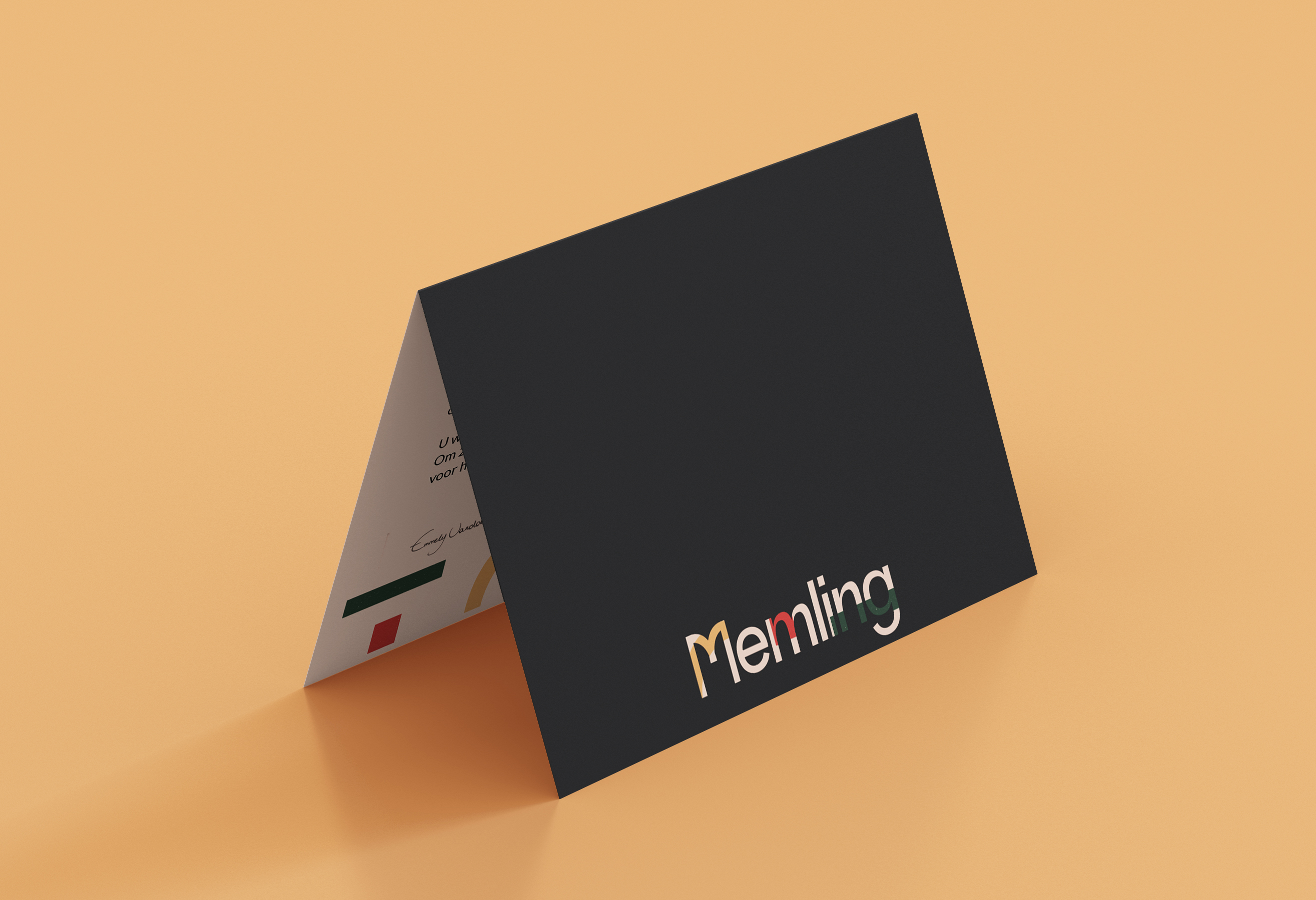
On top of that I made sure the invitation for the private opening
of Memling was unique. I used a cut-out form for the logo:
a little sneak peak of what you can expect from a
unique concept like Memling.